UI/UX Redesign for Townscript- Rekindling Indian Youth's Love for Events
A design solution to help achieve substantial business outcomes faster, along with a significant boost in engagement for new, unique events.
Townscript is an event platform making online event registrations and ticketing an easy and awesome experience for event organizers and bridging the gap between organizers and enthusiasts.
Despite being full of people, India has become a lonely place with our focus stuck on 5-inch screens glowing into our faces. We feel there is no choice and we’ve forgotten how to have a conversation with other humans.
The challenge was to create a system that understands you as a person, which allows you to be with people everyday through shows and events; and a solution that also pushes a delightful group experience.
‘To discover not just events, but yourself!’
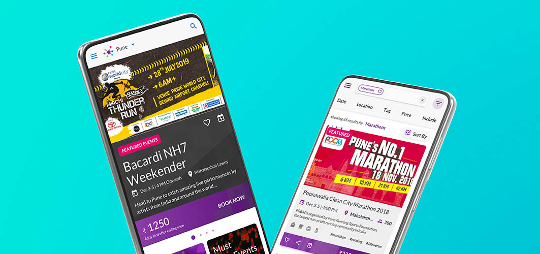
Objective of Design
The two major aspects of Townscript redesign were- how should we boost engagement on Townscript? And a solution to enable users to discover and explore meaningfully. This led to establishing our design objectives such as:
- Reignite youth’s love for events by offering a seamless and delightful user experience of the platform.
- Re-design the event listing, and event pages to ensure users find and attend events which they like and enjoy.
- An effective solution to prompt users to use features that would benefit them.
- Simplify ticket booking process.
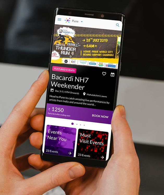
Our Process
Pain Points
- Tedious ticket booking process.
- Lack of powerful features for the event creators/organizers, for offering those to the audience.
- Users unable to find relevant events.
- Users unaware of the features available for their usage.
- High number of support request calls.
Discovery
- The design solution needed to be user-friendly for the audience which displays information they require on a particular event and that is ready to book on the first view.
- Event organizers found it difficult to showcase events and features to the audience as per their requirement and hence it was essential to build tools and widgets such that organizers find everything at Townscript.

Implementation
- Users once triggered should be able to efficiently and easily book their tickets to reduce the time taken to book tickets.
- Increasing awareness and adoption of features of the platform using contextual prompts and appropriate onboarding strategy.
Outcomes
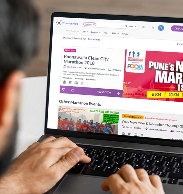

Outcomes
Our design team worked on various aspects of the website considering the audience as well as for the event creators:
- An all new home page, re-designed to allow users to explore events.
- Widgetized event page, with information structured to nudge bookings.
- Seamless design for mobile audience.
- Simplified language and information structure that works well for mobile interface.
- Clear call to action, information styling to ensure a user always knows where he/she is in the journey, and what is next.
- Re-structure of payment options based on usage data.
- User-friendly defaults to nudge payment modes.
An All New User Experience to Boost Engagement for New, Unique Events
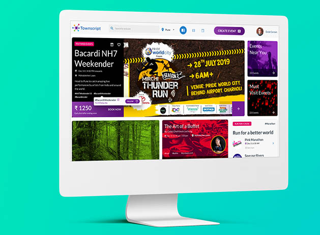

An All New User Experience to Boost Engagement for New, Unique Events
- We designed a platform which understood the preferences of the audience and suggested interesting things around their likes, in which they can engage themselves.
- This would initially push the user and then hook them to be with people of similar interests. Therefore, this broke the cycle of events that promote themselves with marketing muscle to showcase items that the user would relate to and love to attend.
- This led to redesigning to ensure they keep coming back to Townscript and to reduce the number of bounce rates. We also simplified the booking process to reduce the time consumed to make a booking and thus increase the number of bookings.
- We created a magazine view that affords ‘browsing’ as against only ‘intentional’ behavior and a space for ‘featured’ events. Sections were based on proximity, time and previous history to nudge relevant exploration.
- Modular card design was adopted to afford multi-content based on what might be each event’s focus. Card design with all the key information needed to make a decision for sharing and booking.
- For booking, we added a group add-on feature and common questions to this page, for minimizing questions on the attendee details section.
- We also re-designed search views to help users identify specific events they are looking for.‘Featured’ events in search lists could open up revenue possibilities. There was a use of gamification (loss aversion) by showing ‘sold out’ results, no. of people viewing and ‘high demand’ tag.
Impact
Business Impact
- The newly designed platform led to a boost in engagement for new and unique events. There was a huge rise in event attendance as well as increase in monthly bookings, and a significant drop in no-shows for events. Event organizers could rely on Townscript to offer various features for the audience.
User Impact
- Users could easily find the events they like and share it with others, which thus increased engagement and reduced bounce rates. The interface design simplified the booking journey for the users and imparted a feeling of joy and delight for attending an event or a show.
Transforming Atidiv’s Global Digital Identity through Website Redesign
Elevating their competitive positioning by clearly showcasing their service strengths with strong content and impactful visuals.


