Reports Made Easy through UI/UX Redesign for TransUnion CIBIL
The redesign opened up a new market segment and provided better usage for 250+ customers and 60k employees.
TransUnion is an American consumer credit reporting agency that validates trust between businesses and consumers, by ensuring that each consumer is reliably and safely represented in the marketplace. TransUnion also markets credit reports and other credit and fraud-protection products directly to consumers.
Commercial credit reports can be difficult to comprehend, especially for first-timers. Credit reports indicate if business organizations (big and small), can avail financial services like loans. Absence of clarity and understanding of a commercial credit report leads to lack of financial credibility.
The challenge for us was to design the report in an easily digestible and delightful format for the customers to understand the report better and in turn aid the customer to make better financial decisions.
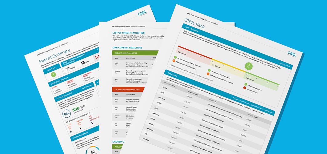
Objective of Design
Collecting information on over a billion individual consumers in over 30 countries made TransUnion realize that their credit report was misunderstood and misinterpreted by most businesses due to its complexity.
For enabling TransUnion cater to a larger chunk of SMEs, the redesign was aimed to:
- Divide the report into sections that helped the individual dive deep into the financial health of each account.
- Revamp the credit report to cater to the needs and queries of SME owners using effective data visualization.
- Provide visually rich reports that are user-tested.
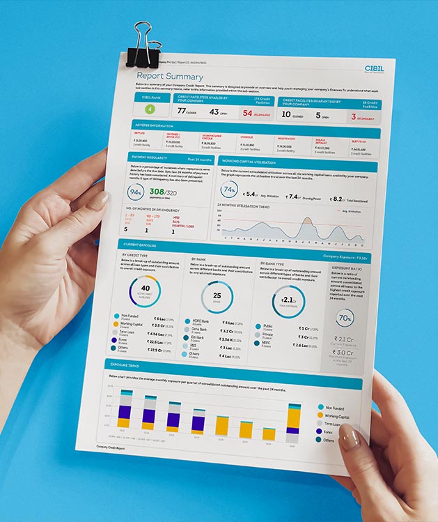
Our Process
Pain Points
- The old credit report needed an annexure to explain its use.
- Difficulty in picking the required information from the current format.
- Most consumers of the report gave up at this stage and sought the help of their accountants (professional help) to bring clarity.
Discovery
- Customers wanted to understand how their business is doing from a financial standpoint through this platform and identify financial problems of the business to solve them.
- The report was a storehouse of the customer’s financial information, and it needed an easily digestible presentation. Understanding the report better would aid the customer make better financial decisions. Customers never felt the need to download and use the report; and they also needed to be wary of maintaining a better credit score, allowing them to avail greater credit services.

Implementation
- We worked out a design solution that clearly indicates financial health, both good and bad, to accelerate the financial decision-making process.
- The value that could be added through the redesign was to clearly inform the user if the business can afford more credit or not, and facilitate financial decision-making.
- One of the primary aspects of our redesign was to enable easy access to credit-related information in an understandable, and consumable format, as well as impart a sense of ownership and delight for the users.
Outcomes
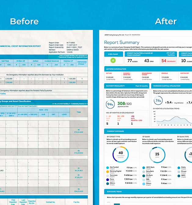

Outcomes
Our design team worked towards structuring the information in the report to meet the user’s goals through careful segregation of financial information into visually rich yet easily consumable content. Our UI/UX process around these aspects led to the following outcomes:
- Impart a sense of delight and achievement through the docket, folder and certificate format.
- Understand the company’s financial health through a credit report summary.
- Appropriate interpretation of CIBIL rank.
- Placement of clear indications where actions need to be taken.
- Default information to educate business owners about financial liabilities.
Structured Reports to Enable Further Financial Decisions
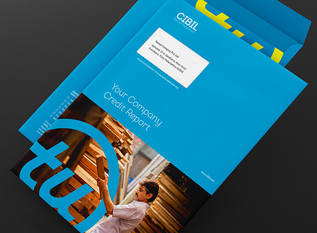

Structured Reports to Enable Further Financial Decisions
- The user-tested, visually rich new credit report was designed considering every aspect, making it easy to use, delightful as well as scalable, that could seamlessly translate between print and web formats.
- Furthermore, the re-designed included aspects such as box envelope, folder, welcome note, rank certificate, company profile, etc. that felt official, appealing, understandable and something a user would be proud of.
Impact
Business Impact
- CIBIL witnessed an introduction of a new market segment in India along with better comprehension and acceptance of the new report format by the business owners across the board.
- Positive feedback and appreciation enabled qualitative analysis of the new straightforward design experience. There were increased sales and subscriptions right from the first two quarters; with diminished support calls and emails.
User Impact
- Easily consumable content resulted in quicker and accurate tasks. Simple segregation of financial information enabled further financial decisions for customers. The new report design imparted a sense of flexibility and control and provided better usage for 250+ customers and 60,000 employees.
- This project was done in collaboration with our partner, Ajency.
Transforming Atidiv’s Global Digital Identity through Website Redesign
Elevating their competitive positioning by clearly showcasing their service strengths with strong content and impactful visuals.


